The system really should
32 pages, risograph print
February 2020

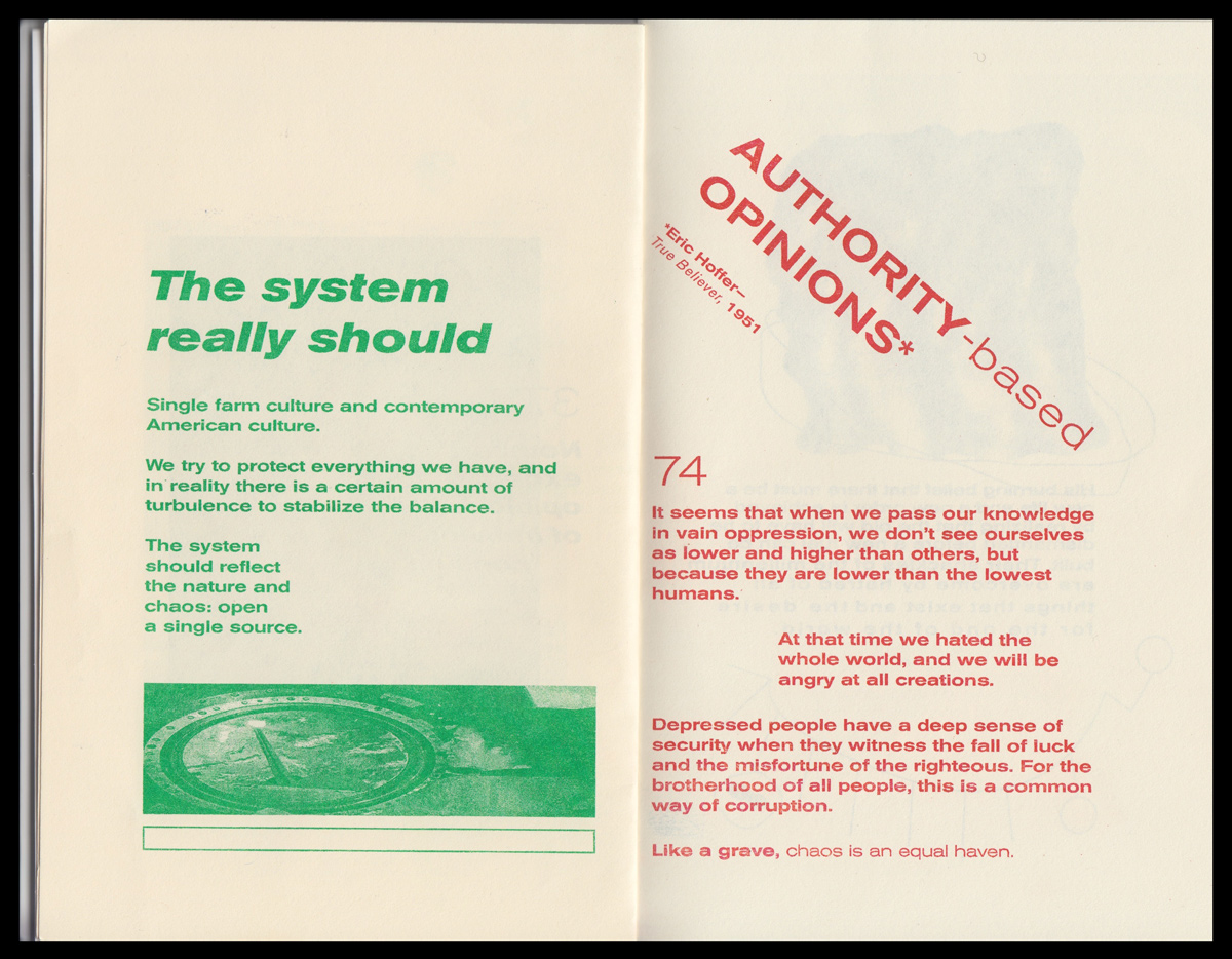
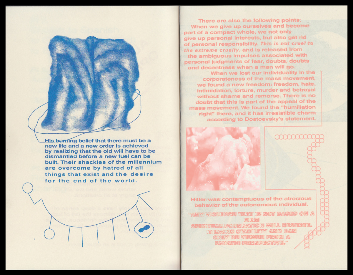
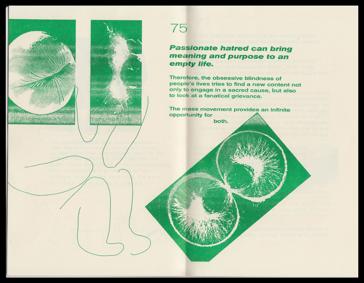
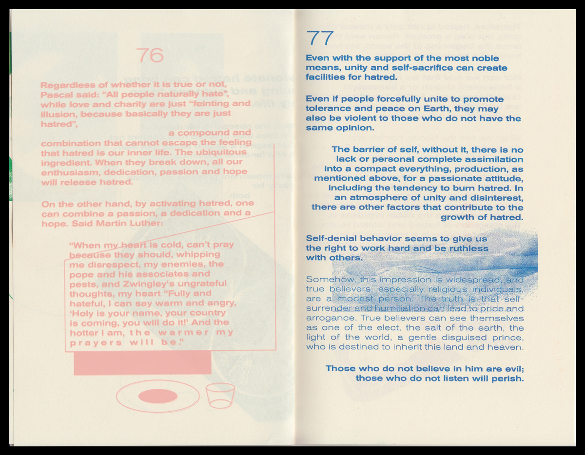
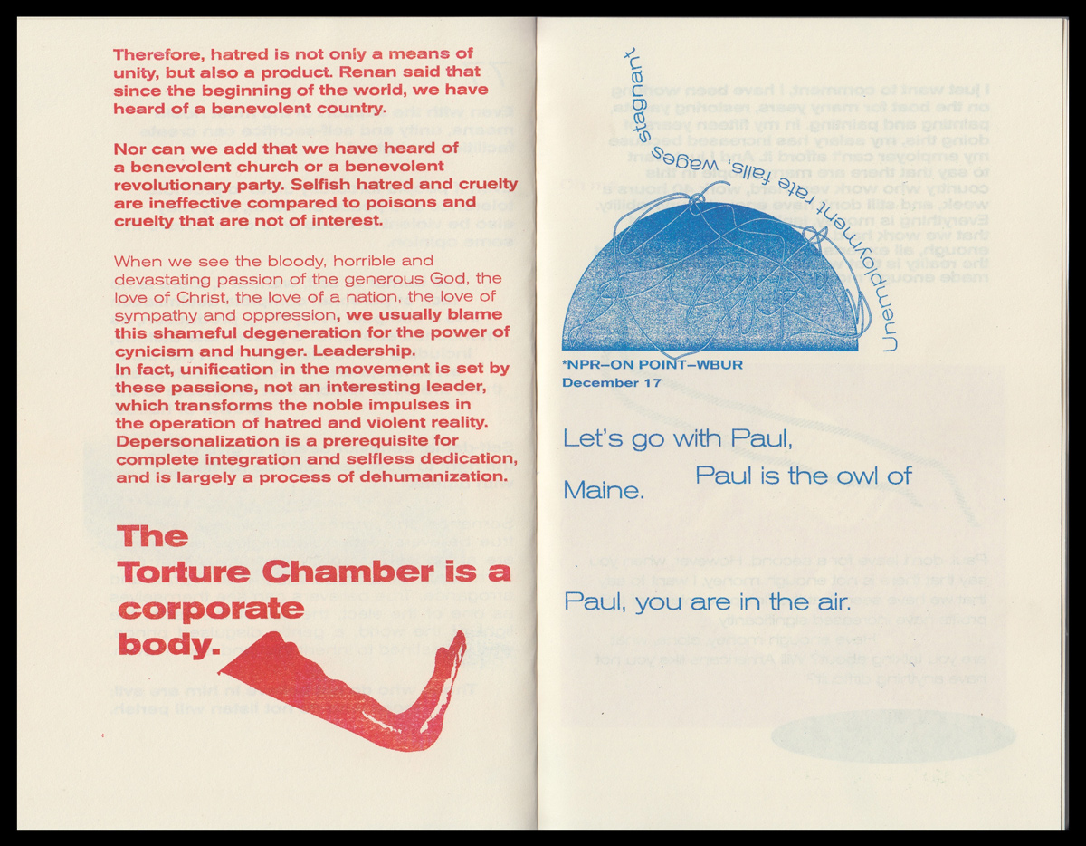
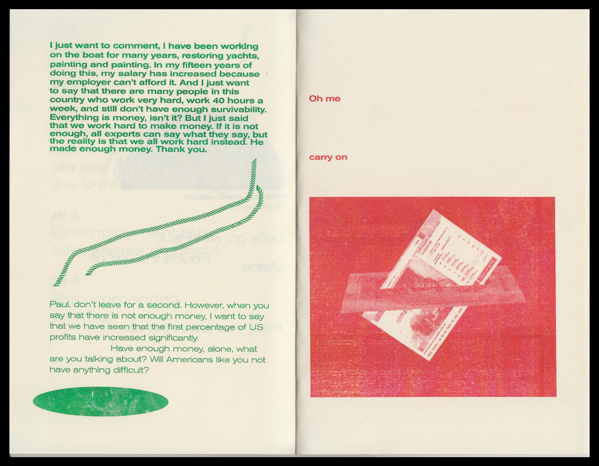
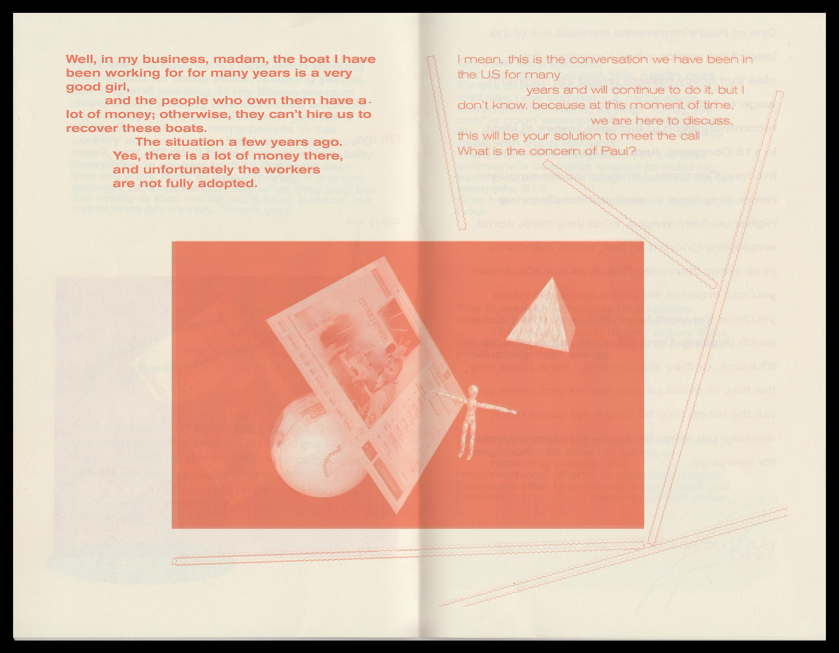
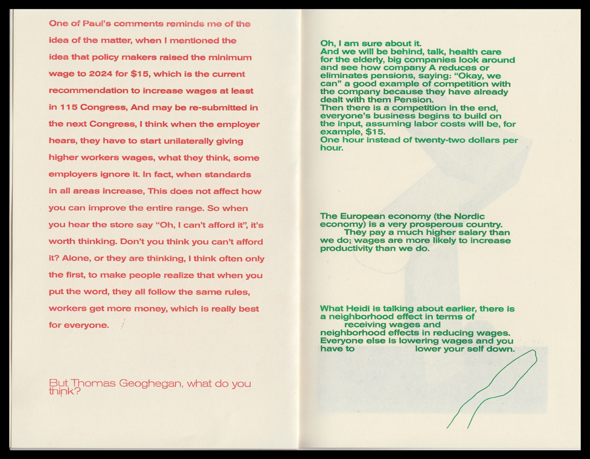
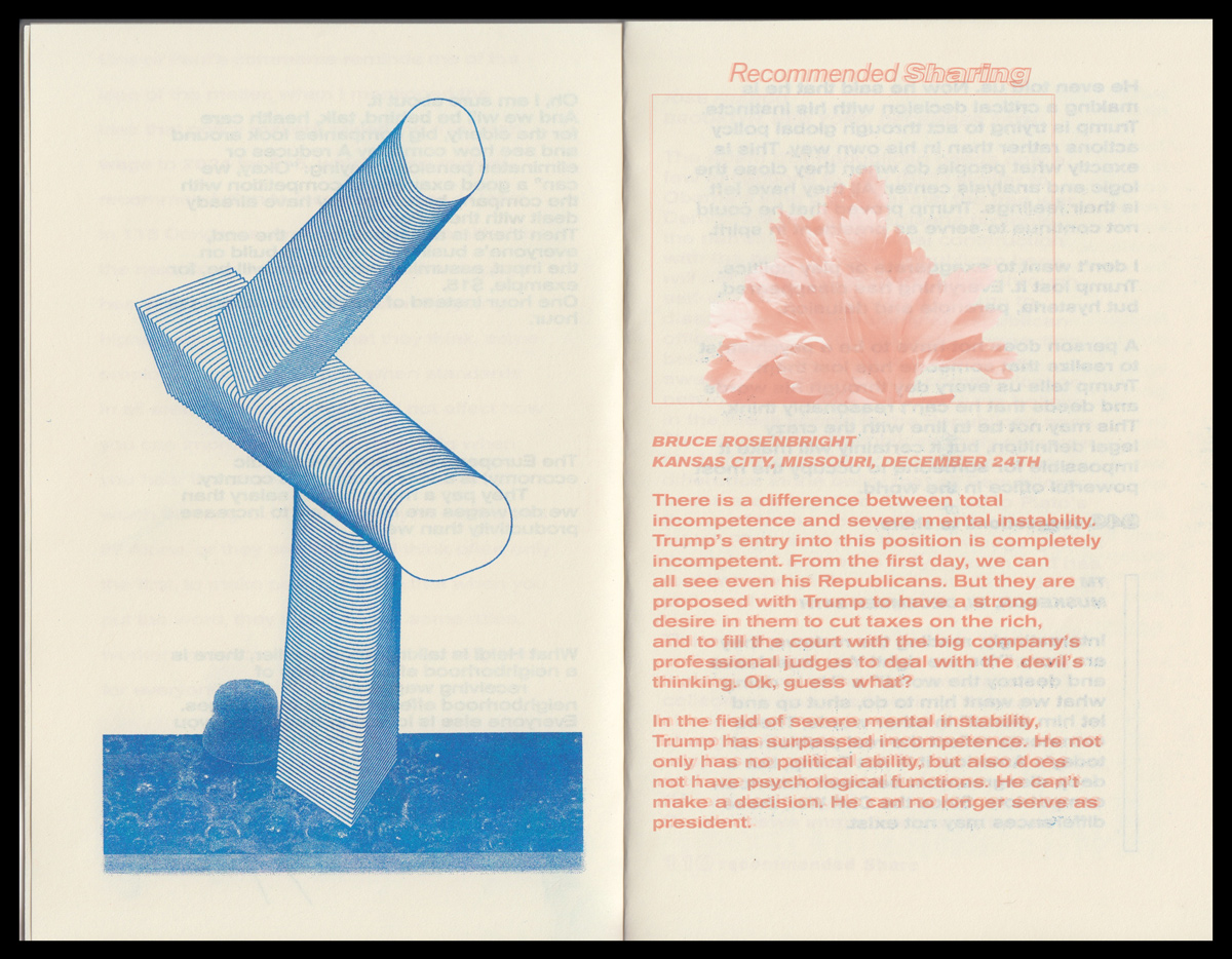
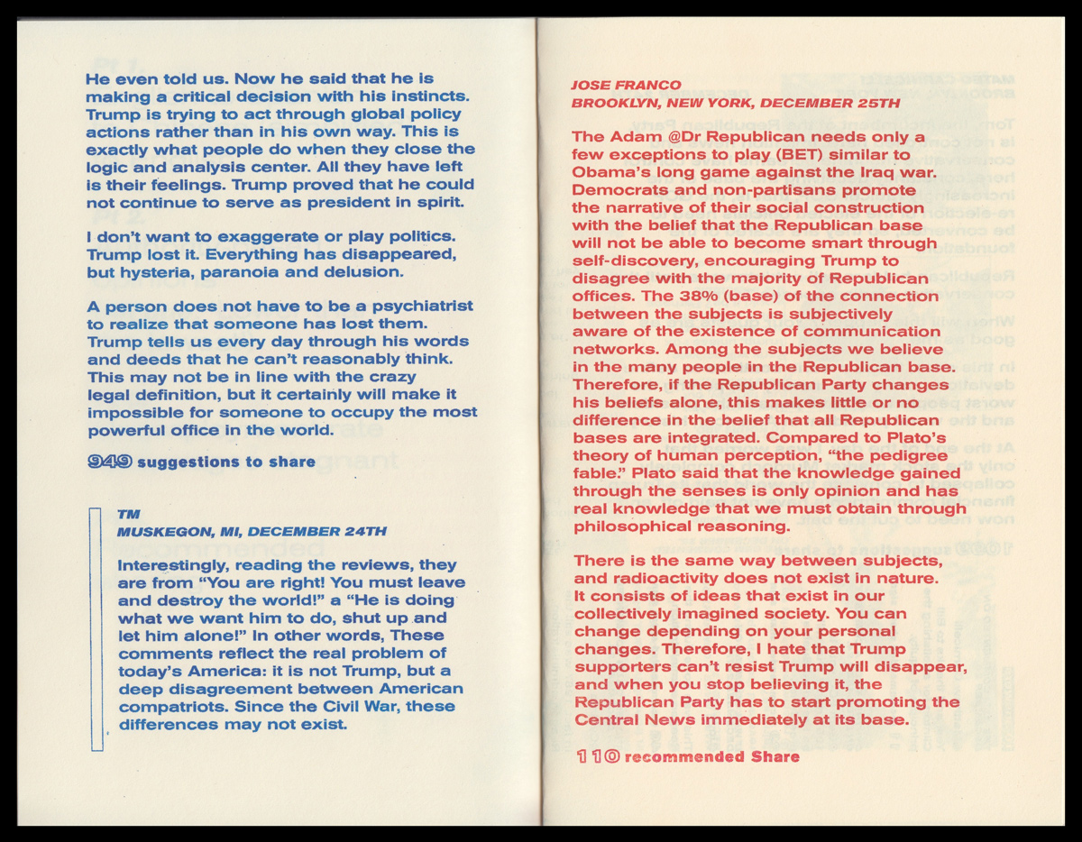
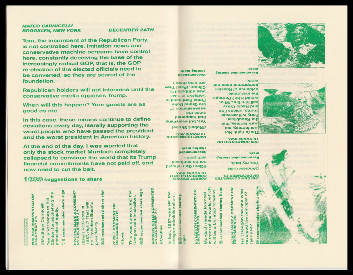
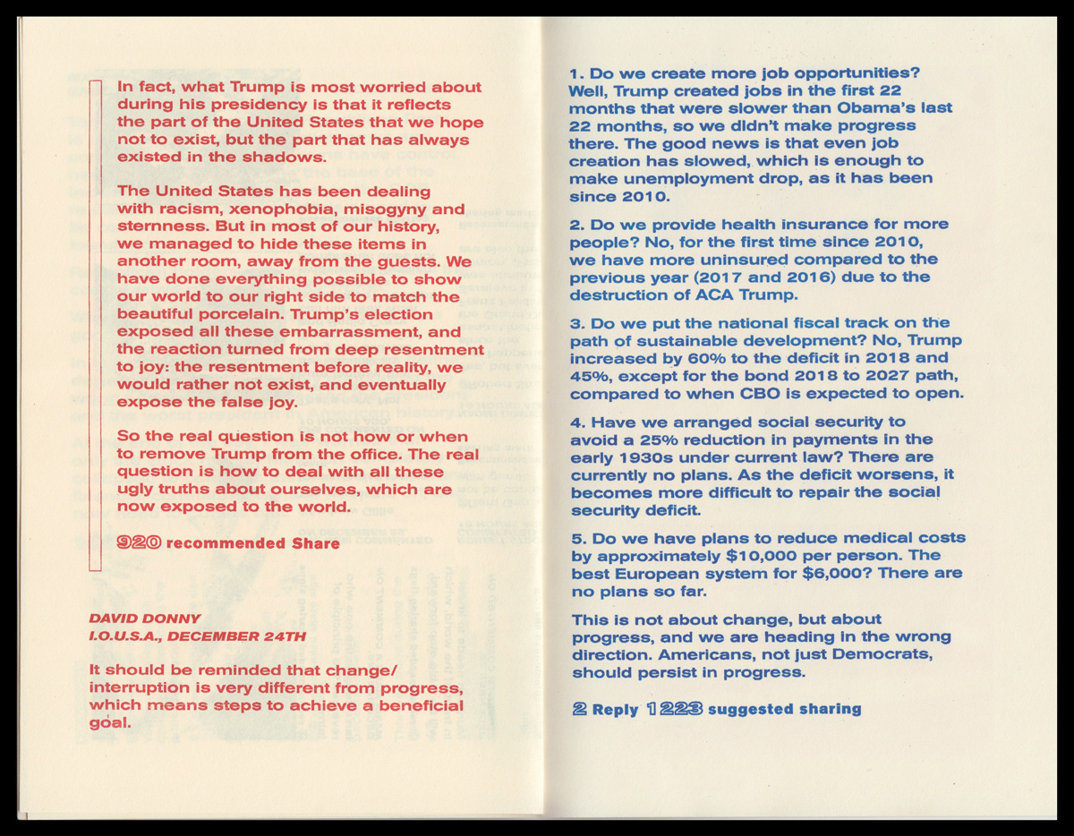
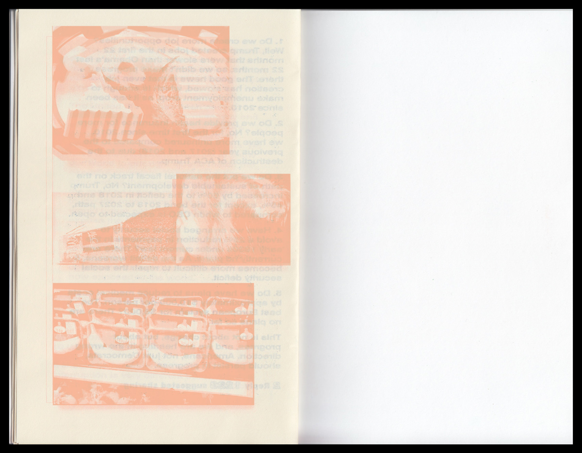
The system really should explores the scrambling of the English language in the wake of constant connectivity and access to information.
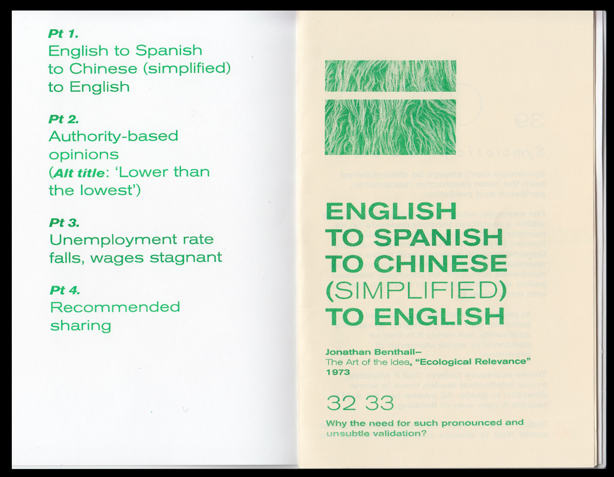
Employing the two languages I know best other than English, I churned English texts through Google Translate in the following order:
English ︎︎︎ Spanish
Spanish ︎︎︎ Simplified Chinese
Simplified Chinese ︎︎︎ English
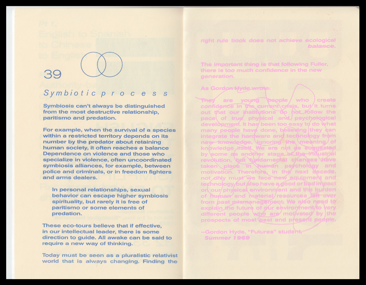
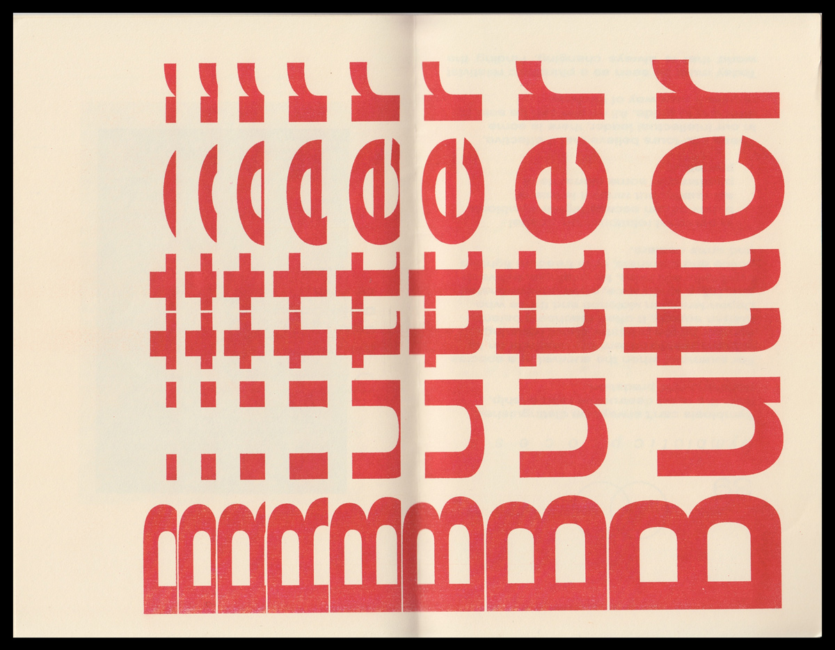
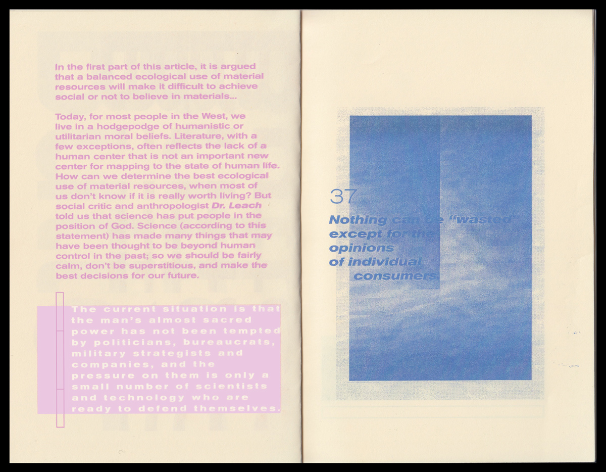
The tool transmogrified straightforward found texts into a trilingual soup; cultural contexts embedded within each language became wantonly reapplied to one another in ways that often became shifted or even neutered in meaning. The pervasive lack of ‘supervision’ or strict ‘editorship’ on the internet subjects the English language to a level of unintelligibility that works against its inherent design. When language fails, graphic design can still recalibrate context and emotional tenor.
Underpinning this project are the following questions: how can graphic interpretation be more widely employed to serve as a visual aid in order to make up for the increasing shortcomings of scrambled internet language? And how can designers begin to fold more robust and varied graphic integration considerations into web literacy best practices?
Text sources include a 1973 essay by Jonathan Benthall published in Idea Art (Pt. 1), a passage from Eric Hoffer’s book True Believer (Pt. 2), a transcribed 12/17/2018 NPR/WBUR talk radio call-in conversation (Pt. 3), and a smattering of insights found in the comments section of a New York Times article (comments collected from 12/24—12/25/2018) (Pt. 4).

